.svg)
NCL components automatically handle validation, state management, and UI
rendering, allowing you to focus on defining the structure and behavior of
your configuration interfaces.
Getting Started
Configuration components can be combined to create forms that collect and validate user input. Each component produces a specific data type output that can be used in your application logic.Basic Input
Simple components for text, numbers, toggles, and selections that form the
building blocks of most configurations.
Complex Controls
Advanced components like sliders, multi-selects, and conditional inputs for
sophisticated configuration needs.
Structured Data
Components for handling lists, dictionaries, and other structured data
formats.
UI Elements
Visual components like dividers, banners, and text displays to improve form
organization and user experience.
Example Configuration
Here’s a simple example of how NCL components can be used to create a model configuration interface: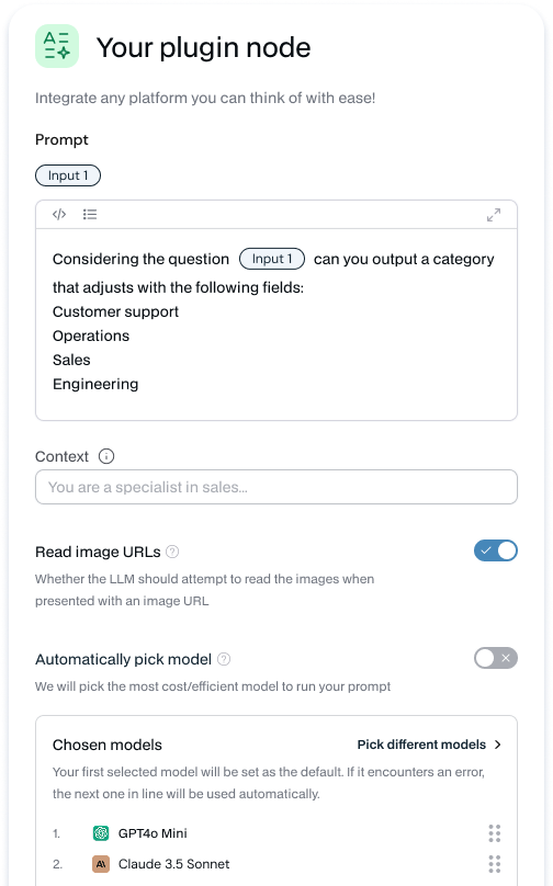
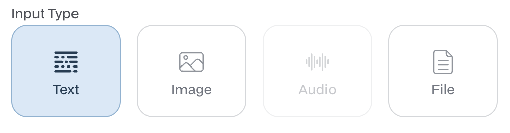
The configuration above will produce the following interface:
Component Categories
Text Input Components
Components for capturing and displaying text input in various formats.ConfigText
Basic single or multi-line text input with optional placeholder text.
Output: str
- placeholder (str) - Default text shown when the field is empty
- number_of_lines (int) - Number of visible text lines, defaults to 1
- show_refresh (bool) - Whether to show a refresh button
- is_code (bool) - Whether to use monospace font and code styling
Output: str
ConfigBigText
Extended text area for longer content with customizable height.
Output: str
- placeholder (str) - Default text shown when the field is empty
- number_of_lines (int) - Number of visible text lines, defaults to 5
Output: str
ConfigRichTextVariables
Rich text editor with variable insertion capabilities.
Output: {text: str, definition: dict}
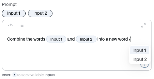
- placeholder (str) - Default text shown when the field is empty
- number_of_lines (int) - Number of visible text lines
- connector_name (str) - Name of the connector providing variables
Output: {text: str, definition: dict}
Selection Components
Components for choosing from predefined options or sets of values.ConfigSelect
Standard dropdown select for choosing a single option from a list.
Output: str
- values (list[str] or list[dict]) - List of options to select from
- placeholder (str) - Text displayed when no option is selected
Output: str
ConfigMultiSelect
Dropdown that allows selecting multiple options from a list.
Output: list[dict[str, str]]
- values (list[str] or list[dict]) - List of options to select from
- placeholder (str) - Text displayed when no options are selected
- max_options (int) - Maximum number of options that can be selected
Output: list[dict[str, str]]
ConfigTypeSelect
Type-aware selection component with specialized UI based on data types.
Output: str
- values (list[str]) - List of data type options to select from
Output: str
ConfigChipsSelect
Selection component that displays options as interactive chips.
Output: str

- values (list[str] or list[dict]) - List of options to display as chips
- can_wrap (bool) - Whether chips can wrap to multiple lines
- label (str) - Label text displayed above the chips
Output: str
Numeric Components
Components specialized for numeric input and ranges.ConfigNumber
Basic numeric input field for integers or decimal values.
Output: float
- No specific parameters required
Output: float
ConfigNumberSlider
Interactive slider for selecting a numeric value within a defined range.
Output: float
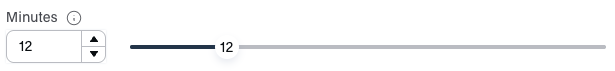
- min (float) - Minimum value of the slider
- max (float) - Maximum value of the slider
- step (float) - Increment step size for the slider
Output: float
ConfigNumberRange
Numeric input field with up/down arrows that enforces minimum and maximum
value constraints.
Output: float
- min (float) - Minimum value of the range
- max (float) - Maximum value of the range
Output: float
Boolean Components
Components for toggling options on or off.ConfigToggle
Simple toggle switch for boolean values.
Output: bool
- No specific parameters required
Output: bool
List and Collection Components
Components for managing collections of items or structured data.ConfigChipsListText
Input field that converts text entries into a list of chips.
Output: list[str]

- placeholder (str) - Text displayed in the input field
- max_values (int) - Maximum number of chips that can be added
- bottom_text (str) - Helper text displayed below the component
- chips_are_closable (bool) - Whether chips can be removed by clicking an X
Output: list[str]
ConfigDictList
Creates an editable list of dictionaries with predefined keys.
Output: list[dict[str, Any]]

- keys (list[str]) - List of keys for each dictionary entry
Output: list[dict[str, Any]]
Special Purpose Components
Components designed for specific platform integrations and use cases.ConfigModelSelect
Specialized component for selecting AI models from available endpoints.
Output: list[str]
- endpoint (str) - API endpoint to fetch available models
- model_type (str) - Type of model to filter by
Output: list[str]
ConfigTimePicker
Specialized input for selecting time values.
Output: str (time format)
- No specific parameters required
Output: str (time format)
ConfigFile
File upload component for single file selection.
Output: list[File]
- No specific parameters required
Output: list[File]
ConfigFileArray
File upload component for multiple file selection.
Output: list[File]
- No specific parameters required
Output: list[File]
Cloud Storage Integration
Components for integrating with external cloud storage services.ConfigGdrivePicker
Google Drive file picker with filtering options.
Output: list[GoogleFile]
- multi_select (bool) - Whether multiple files can be selected
- file_type (str or list[str]) - File types to filter by
- setIncludeFolders (bool) - Whether folders can be selected
Output: list[GoogleFile]
ConfigOneDrivePicker
Microsoft OneDrive file picker with filtering options.
Output: list[OneDriveFile]
- base_url (str) - Base URL for the OneDrive API
- multi_select (bool) - Whether multiple files can be selected
- file_type (str or list[str]) - File types to filter by
- set_include_folders (bool) - Whether folders can be selected
- name (str) - Display name for the picker
Output: list[OneDriveFile]
UI Components
Components that enhance the visual organization and user experience.ConfigDivider
Simple horizontal divider with optional label for form section separation.
Output: None (UI element)
- label (str) - Text label displayed in the divider
Output: None (UI element)
ConfigBanner
Styled banner for displaying important messages or information.
Output: None (UI element)
- label (str) - Text content of the banner
- style (str) - Visual style (“info” | “warning” | “error”)
Output: None (UI element)
ConfigTextDisplay
Non-editable text display with optional title for showing information.
Output: None (UI element)
- label (str) - Label for the display
- title (str) - Title displayed above the text
- text (str) - Content text to display
Output: None (UI element)
Advanced Components
Complex components for specialized use cases and conditional logic.ConfigConditionSelect
Selection component that enables conditional rendering based on a
connector.
Output: list[str, None]
- connector_name (str) - Name of the connector to use for conditions
- values (list[str] or list[dict]) - List of options to select from
Output: list[str, None]
ConfigComplexCondition
Advanced conditional logic component for complex form behaviors.
Output: list[dict]
- No specific parameters required
Output: list[dict]
ConfigTypeDictArray
Component for managing typed dictionary arrays with mapping.
Output: list[dict]
- values (list[str] or list[dict]) - List of type options
- type_map (dict) - Mapping of types to their configurations
Output: list[dict]
ConfigVariableInputValue
Dynamic input that adapts based on specified types.
Output: Any
- types (list[str]) - List of supported input types
Output: Any
Best Practices
When building configuration interfaces with NCL, consider these best practices:Logical Grouping
Group related configuration options together to improve usability and user
flow.
Progressive Disclosure
Use toggles or conditional components to hide advanced options until
needed.
Clear Labeling
Provide clear, descriptive labels and placeholders to guide users.
Validation Feedback
Leverage built-in validation capabilities to provide immediate feedback on
input errors.
For complex forms, consider using ConfigDivider components to create logical
sections and improve visual organization.